
Penfield Little League Logo
Penfield, New York, a eastern suburb of Rochester, is home to a robust Little League program. Established in 1952, the organization offers leagues arranged by player age, from four to 16 years old.
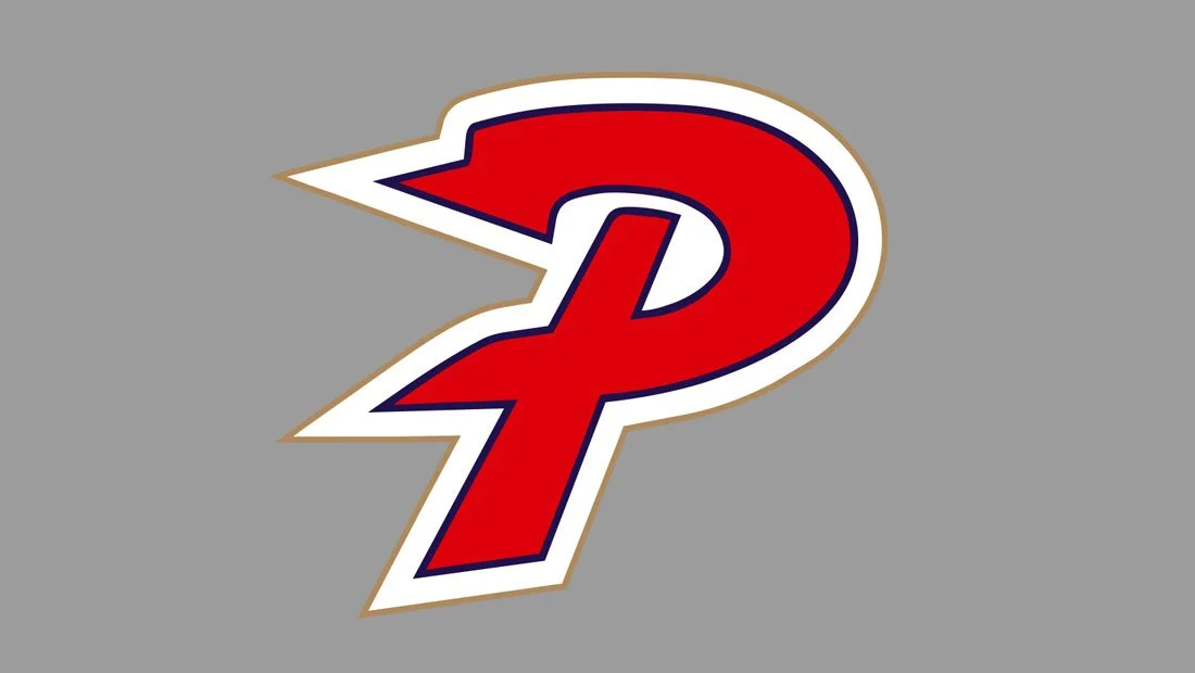
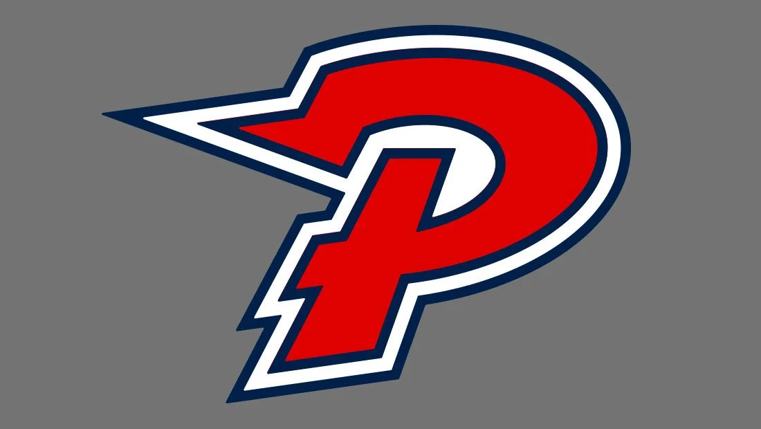
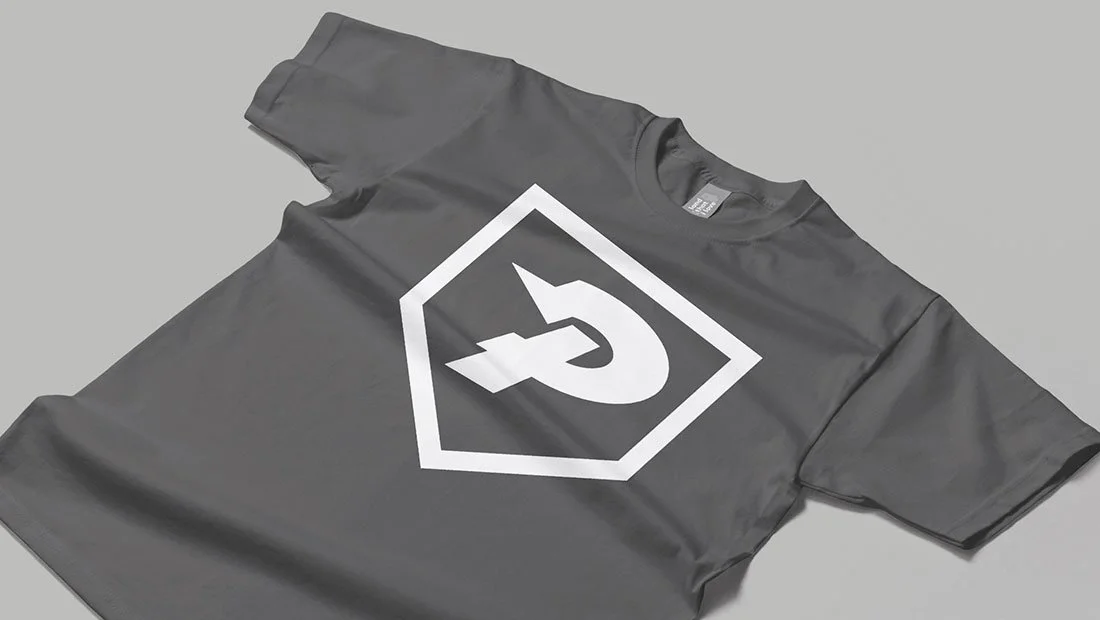
Penfield Little League appears to use two main logos: an official-looking primary District Four logo and a secondary stylized letter P logo. These two logos appear throughout the organization’s social media posts and promotional materials. The District Four logo features a baseball over two crossed baseball bats atop a baseball diamond, all of which is encircled with Penfield Little League. This logo is used on the organization’s website and serves as the social media profile photos. This logo is often accompanied by the stylized letter P logo. The organization also uses several logos for league camps and programs. This logo re-design project is concerned only with the Penfield Little League letter P logo design.
It is important to note that Penfield Little League did not solicit this logo redesign endeavor. What follows is an opinion piece on the strengths and weaknesses of the current Penfield Little League logo. Insomniac Studios did not design the current Penfield Little League logo. The goal of this case study is to critique and improve the existing logo design.
Penfield Little League is an official Little League program.

Logo Re-Design Project
The Penfield Little League logo is a solid design for a Little League program. It looks sporty and modern and has some nice elements going for it, most notably the pennant/lightning bolt at the P’s top left. However, the logo’s design is plagued by poor geometry that weakens the overall design and creates legibility issues at small scale.
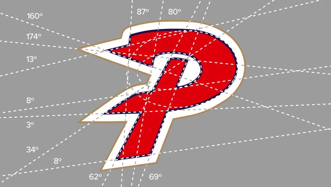
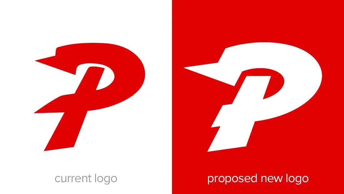
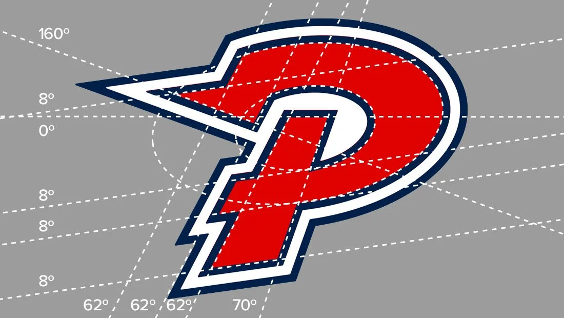
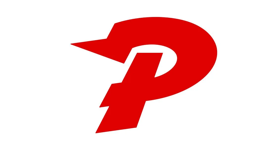
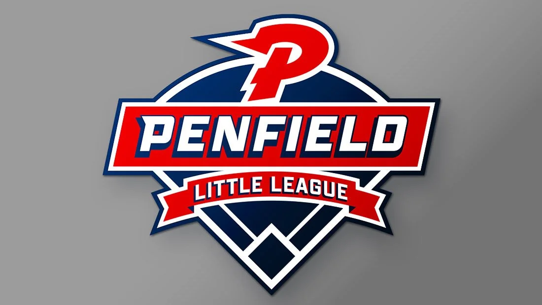
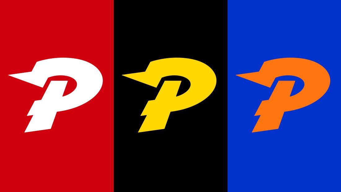
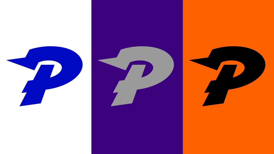
The goal of this logo revisions was to standardize the logo’s geometry and reduce the height-to-width ratio, as the mark felt unnecessarily tall. An image below shows the eclectic collection of random angles used to design the current Penfield Little League logo. Of the 11 angles used, only one (eight degrees) appears twice. Further below a graphic shows the revised logo concept using only five different angles to accomplish the same task. This approach helps to standardize the logo and give it a more professional and consistent look.
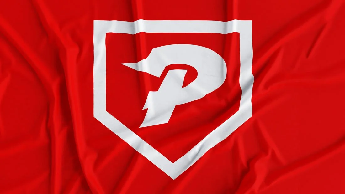
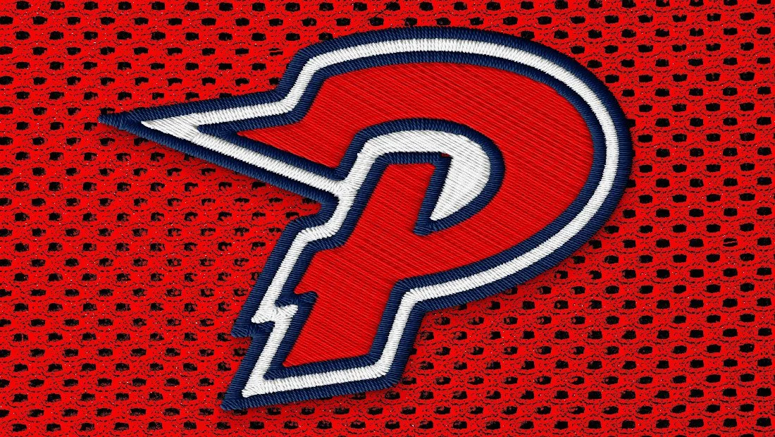
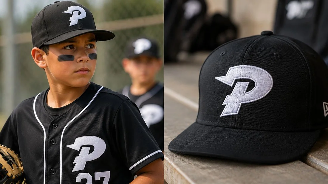
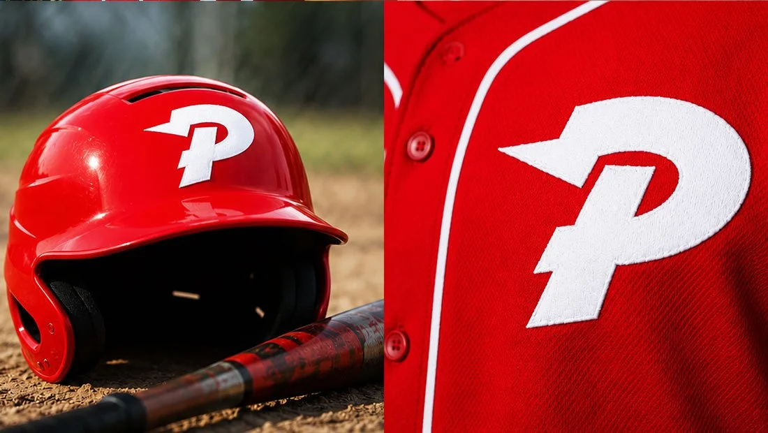
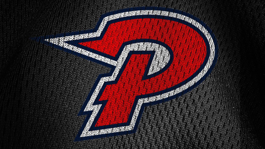
While most of the logo’s current design was preserved, the redesign spent care to sharpen and enhance the lightning bolt shape at the top of the P. This bold change provides the revised logo design with more presence and energy than the current version.
Navigate: Logo Design | Brand Identity

Marketing Case Studies
Insomniac Studios logo design, branding and marketing case studies are an in-depth analysis of a project or concept. Some marketing case studies are the result of a client relationship. Others explore solutions to hypothetical projects. Not all marketing case studies represent a contract or partnership with the entity presented. The logo design, branding, marketing, graphic design, advertising, strategies, concepts and analysis presented are the copyrighted and intellectual property of Insomniac Studios and its clients.
Contact Insomniac Studios
If you like the thinking behind this branding and logo design project and would like to put it to work for your company or organization, contact Insomniac Studios.