CLE Flag Project Logo Design
The CLE Flag Project is a group of proud Cleveland, Ohio, residents who campaigned to reimagine the city’s flag. The idea emerged during a business trip to Chicago, where the Chicago flag is a prominent cultural fixture. The Chicago flag’s simplicity, symbolism and visibility inspired the group consider the Cleveland flag. Upon returning to Cleveland, the group recruited like-minded residents and embarked on a two-year-long project to reimagine the Cleveland flag. The result is the new People’s Flag of Cleveland, Ohio. A 'people’s flag’ is a flag that is widely accepted by a city’s citizens but has not been officially adopted by the local government. Learn more about the CLE Flag Project and the new People’s Flag of Cleveland, Ohio.
Navigate: Logo Design | Secondary Logo Design | Social Media Logo Design | Organization Branding

Logo Design Project Overview
Two core issues faced the CLE Flag Project logo design: That most Cleveland residents did not know Cleveland had a flag. It was rarely flown and, when it was, it was often confused for France’s flag. Both the French and Cleveland flags are red, white and blue tricolors. Second, any symbolism in the logo might influence public perception of what a new Cleveland flag could look like and perhaps not for the better.
The CLE Flag Project was open to a variety of logo concepts, with one requirement: that the logo use a light, sky blue color. Later, the hue was slightly darkened to improve contrast against the white logo
Logo Design Process
Very early in the design process it was decided the logo would feature a plain flag-shaped mark. This would serve to solve the two key issues: inform the population of Cleveland, Ohio, that there was a public awareness effort to obtain a new flag or, at the very least, educate Clevelanders that the city, in fact, had a flag.
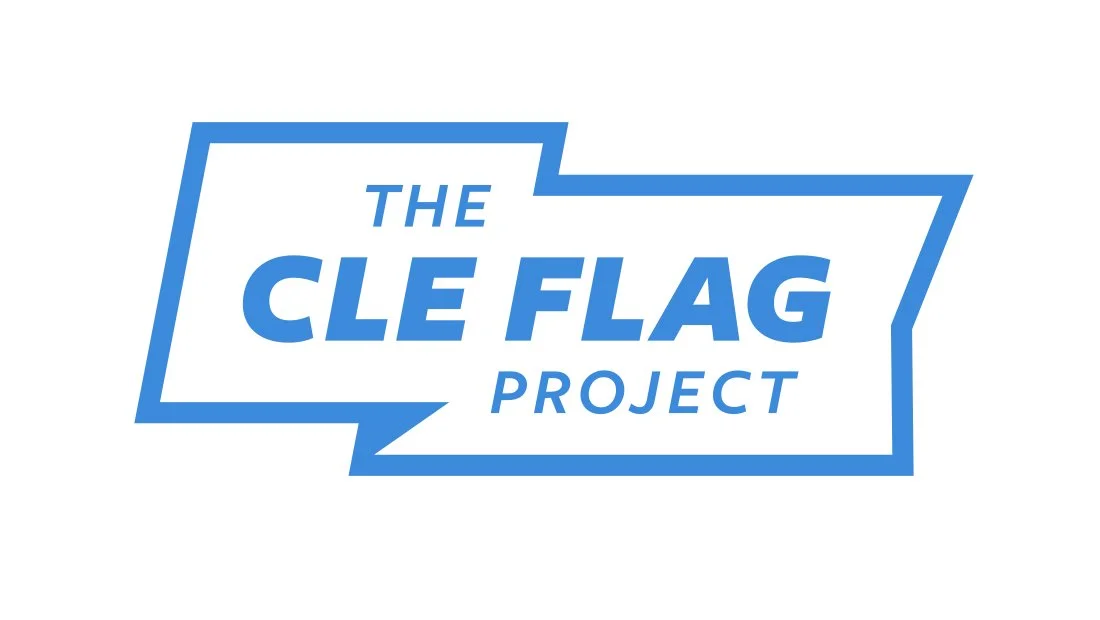
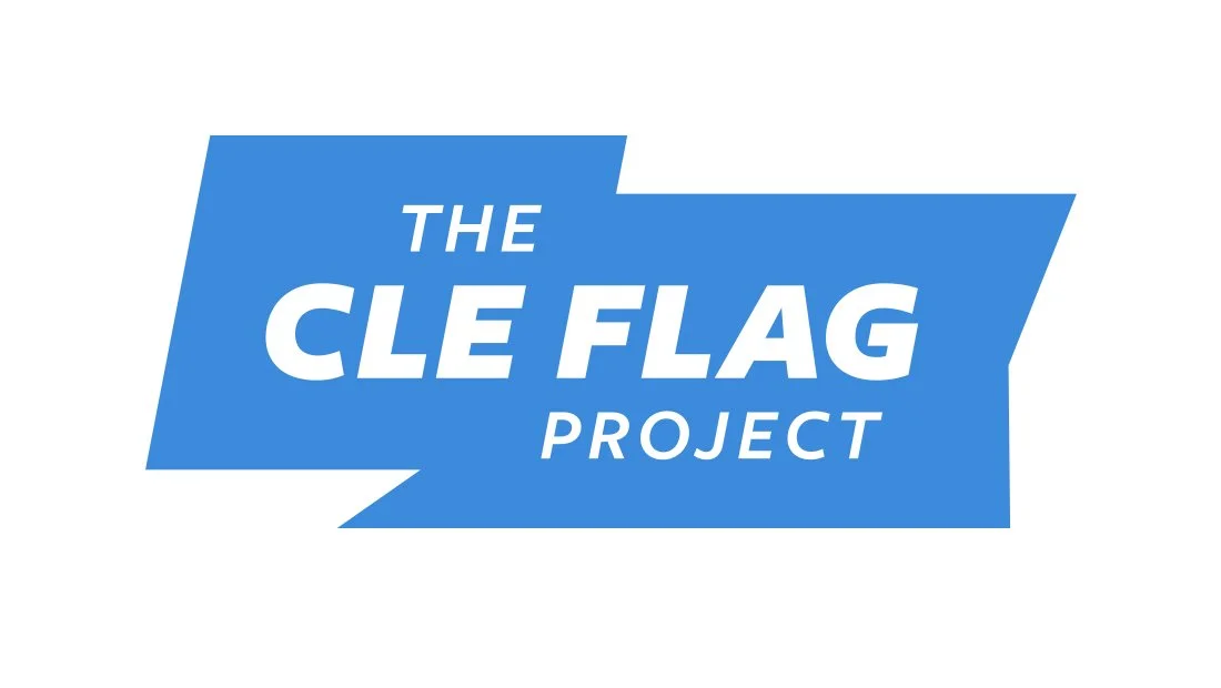
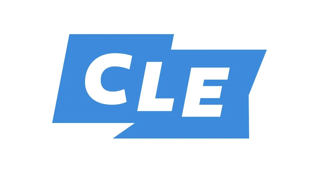
Insomniac Studios developed two flag-based logo concepts for the CLE Flag Project. Both logo designs featured the organization’s name and a flag image. The first logo design featured a more curved waving flag, while the second (shown here) featured a more angular flag logo mark.
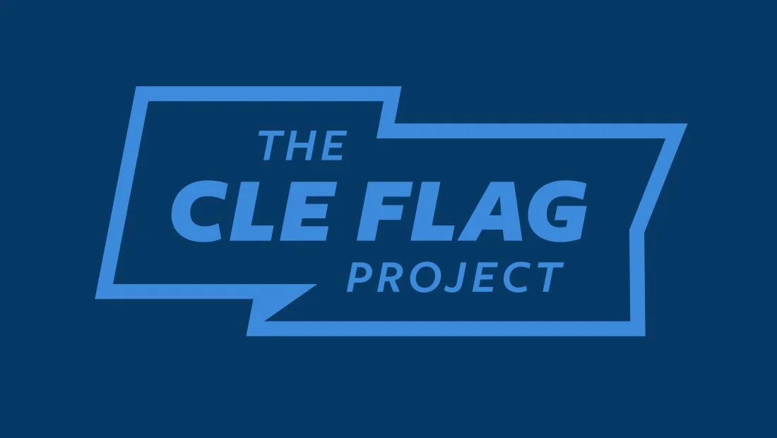
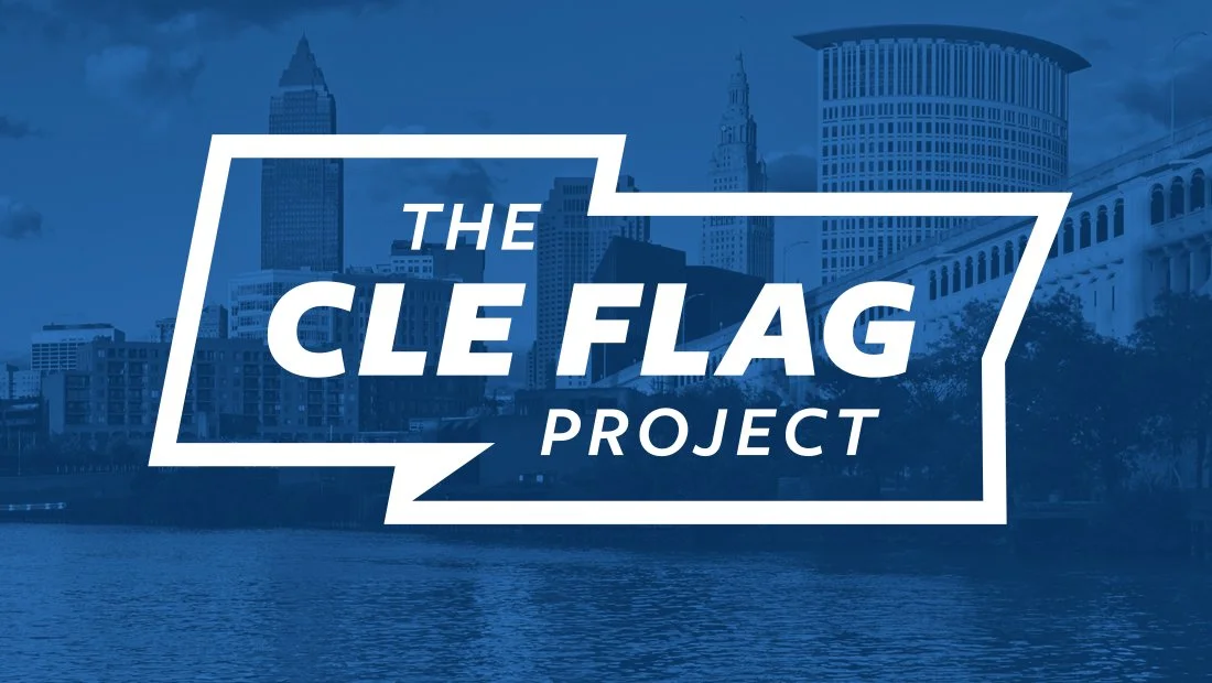
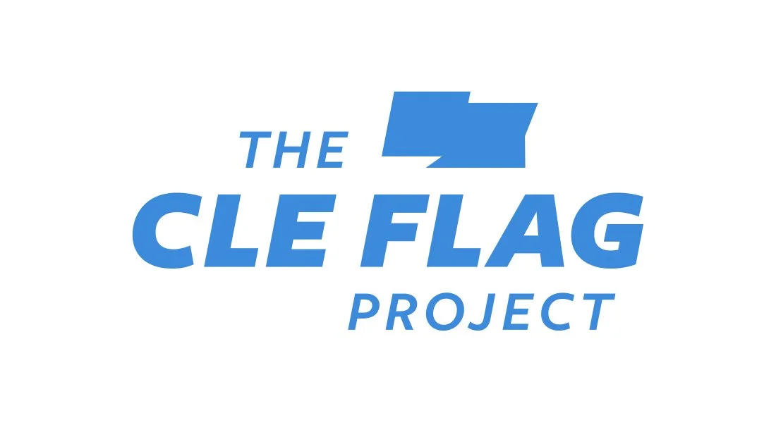
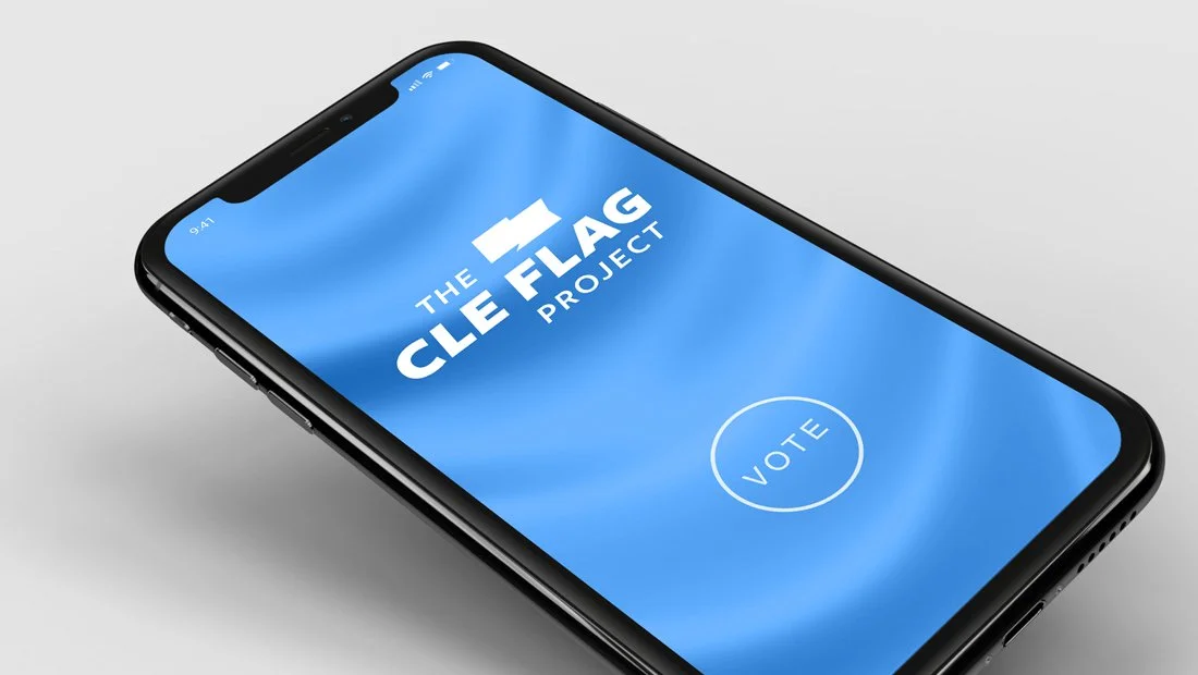
The flag logomark appears consistently across the system. In the primary design, the flag shape encloses the typography. The secondary version features the same flag shape filled-in and flying above the logo. In the social media logo, a simplified flag bearing the letters “CLE” ensures readability at small scale.
Navigate: Logo Design | Secondary Logo Design | Social Media Logo Design | Organization Branding
Logo Design
Secondary Logo Design
Social Media Logo Design
Navigate: Logo Design | Secondary Logo Design | Social Logo Design | Organization Branding
Organization Branding

Navigate: Logo Design | Secondary Logo Design | Social Media Logo Design | Company Branding
Marketing Case Studies
Insomniac Studios logo design, branding and marketing case studies are an in-depth analysis of a project or concept. Some marketing case studies are the result of a client relationship. Others explore solutions to hypothetical projects. Not all marketing case studies represent a contract or partnership with the entity presented. The logo design, branding, marketing, graphic design, advertising, strategies, concepts and analysis presented are the copyrighted and intellectual property of Insomniac Studios and its clients.
Contact Insomniac Studios
If you like the thinking behind this branding and logo design project and would like to put it to work for your company or organization, contact Insomniac Studios.
