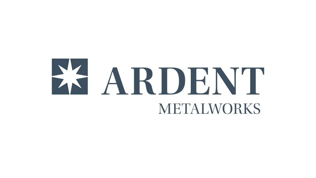
Ardent Logo and Brand
After more than a decade in business, owners Mike and Christina Wood decided to take their company in a new direction. The metal fabrication company, Capital Region Customs, manufactured and finished custom automotive and racing parts. The team set their sights on a new market: custom luxury home and hotel metal design and fabrication.
The years passed, and the company became recognized as a bastion of quality and impeccable craftsmanship. Mike and Christina sought work outside the automotive and racing industry. The company began to fabricate custom metal parts for luxury and boutique hotels like the Soho Grand Hotel in New York City. The team also fabricated the upscale metal interior of the third legal cannabis dispensary in New York City.
As the business shifted to custom, high-end fabrication, the team decided to replace the company name and visual identity with a full rebrand. Insomniac Studios was asked to develop a new name for the company to position it as a custom luxury metal craft brand. Following the new name, Insomniac Studios would create a new logo and visual identity for the company.
Navigate: Logo Design | CNC Logo Design | Social Media Logo Design | Company Branding


Naming Project
The project’s first phase was to develop a new company name. After the new company name, the logo and visual brand identity would follow.
In creating a list of new company names, Insomniac Studios considered literal definitions as well as emotional associations or connotations. Insomniac Studios recognizes the subjective nature and bias of this interpretation, but also recognizes its value for establishing a connection with current and prospective customers.
Some companies employ superlative or luxury words in their names in an attempt to elevate the company’s product or service to a luxury status. In most cases, however, they fail to do so. True luxury does not have to be labeled as such. Insomniac Studios eschewed using the word ‘luxury’ or synonyms like ‘elite’ and ‘premier.’ A company cannot be a luxury company by calling itself ‘luxury’ no more than a person can be taller by calling themselves tall. A company must live up to its customers’ expectations in the luxury market or be relegated to a lesser-value market.
From the eight new names presented, the team selected Ardent Studios, which was later changed to Ardent Metalworks. The word ‘ardent’ means to be enthusiastic, passionate or intensely devoted. These terms are excellent descriptions of the attitude and conviction owner Mike Wood brings to his work. During the project’s discovery, Wood stressed several times the lengths he and his team go to get projects done and done right for his clients. From matching paint colors by eye until they are an exact match to scrutinizing the merit of each weld, the team is unsurpassed in its devotion to quality.
However, ‘ardent’ has an older meaning. First appearing in 14th century Latin and later Old French, ‘ardent,’ in various archaic spellings, means “to burn, emit light or flame, be fiercely hot, shining.” By including the word’s original meaning, ‘ardent’ reflects both dedication and the actual fire of welding, connecting the company’s ethos with its craftsmanship.
The first two letters in ‘ardent’ are Ar, the periodic symbol for argon. This is the team’s preferred inert shielding gas for welding. This third aspect adds a technical welding detail to the company’s new name.
Logo Design Brief
Insomniac Studios and the Ardent Metalworks leadership team developed a set of five tenants that would guide the logo design process. The tenants are as follows:
The logo should be simple and elegant. It should be able to stand alongside other luxury brand logos.
The logo mark, or symbol, should be unique and offer meaning relevant to Ardent Metalworks.
The logo should have no, or as few as possible, enclosures for easy CNC machine reproduction.
No imagery or design elements related to the welding, fabrication, automotive or racing industries.
No skulls or crossbones.
Each of the five guidelines presented creative challenges. However, excluding skulls and crossbones (number five) was straightforward. Working to establish the company in the custom luxury metalwork market, the team knew a skull was not the way to present the brand.
Luxury Logo Design Process
The first part of the logo design process was a deep dive into the world of luxury brands. Insomniac Studios collected logos from luxury brands to establish a logo design baseline. The team reviewed logos from venerable luxury brands like Cartier, Gucci, Rolex, Louis Vuitton, Tiffany & Co. and more.
During the past ten to fifteen years, luxury brands underwent a transformation. Many opted for the clarity of simple and modern typefaces over classic serif or script typefaces. Several luxury brands dropped their logomark, leaving only the wordmark. Most notable in this category was Louis Vuitton, which made headlines when it dropped the famous LV logo from its website’s header, defaulting to an all-capital letter wordmark comprising the typeface Futura. The company still uses the iconic two-letter monogram, but not as part of its primary logo.
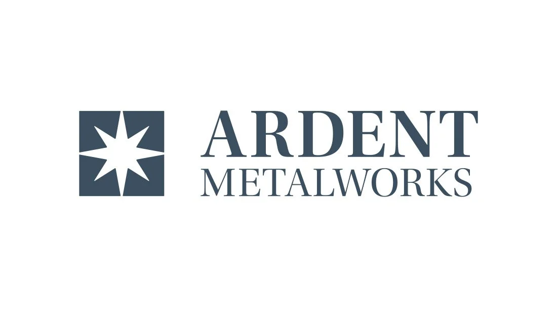
A few luxury brands, like Coach, Hermes, Rolex and Dior, kept the classic serif typeface. As Ardent Metalworks did not have the history or pedigree to shed the serif and don a sans serif typeface, the decision was made to lean into the classical lettering of the serif typeface Utopia Standard.
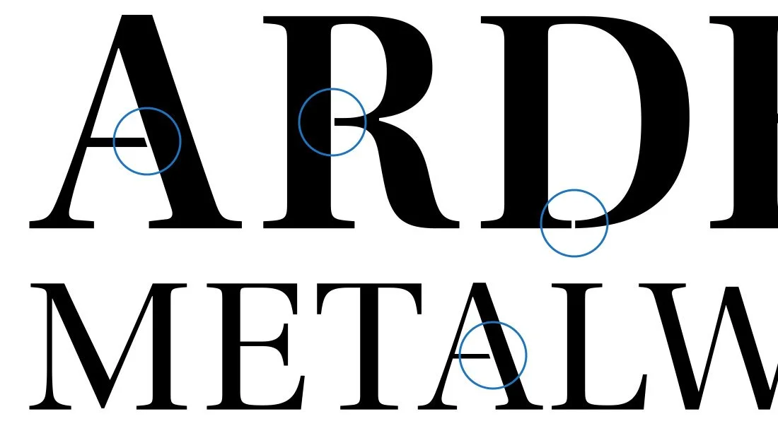
Perhaps the greatest challenge of the project came from tenant number three, which was a requirement that the logo be able to be cut from steel using a CNC (computer numerical control) machine. This meant enclosed shapes, like a circle, square or triangle, needed a cut in the shape so the CNC machine could cut the shape in one pass. This posed two challenges to the logo design process: 1., a break in any enclosed shape needed to be included into the design or the logo had to be a solid shape with no hollow voids inside the logomark, and 2. find a way to keep the logo’s lettering from looking like a military stencil—a task made more difficult by the decision to proceed with a serif typeface.
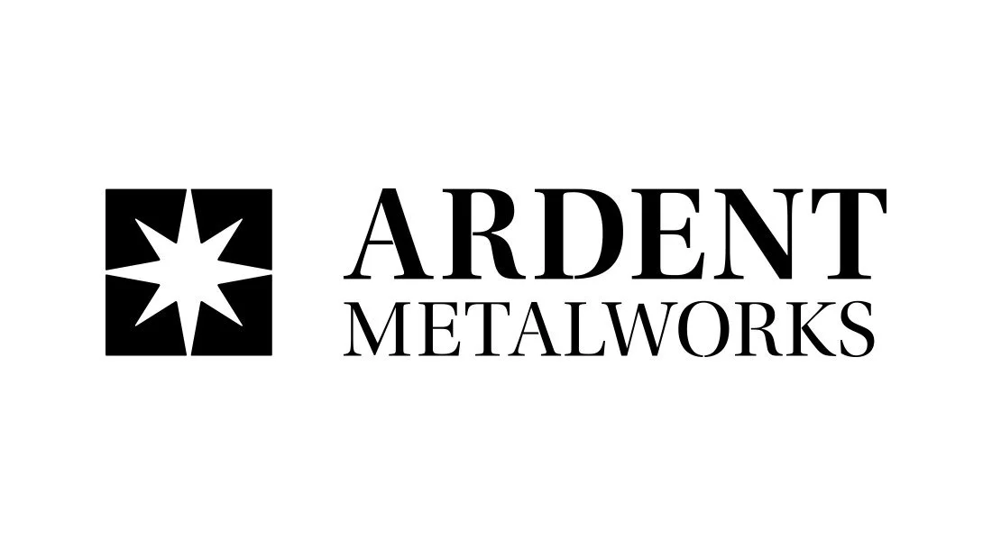
To solve this, the logo needed to be designed in a manner that facilitated CNC reproduction. The typeface, however, was another issue. Since the new company name, Ardent Metalworks, included the enclosed letters A, R, D and O, a solution was needed. Rather than create one logo with stencil-like letters for the CNC machine, two versions were developed. The first was used for screen and print applications. It featured the letters as they typically appear, with an enclosed A, R, D and O. A second version was created with cuts in the letters to allow the CNC machine to pass through and cut out the inside of the enclosed letters. This version is seen below with the cuts in the letter shapes circled in blue.
Logo Design Meaning
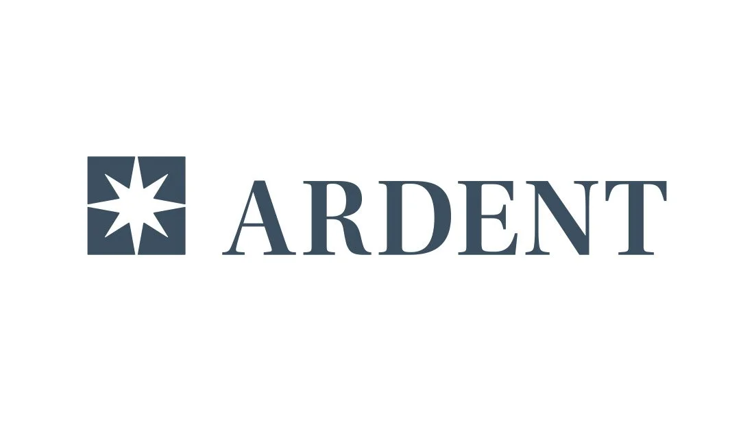
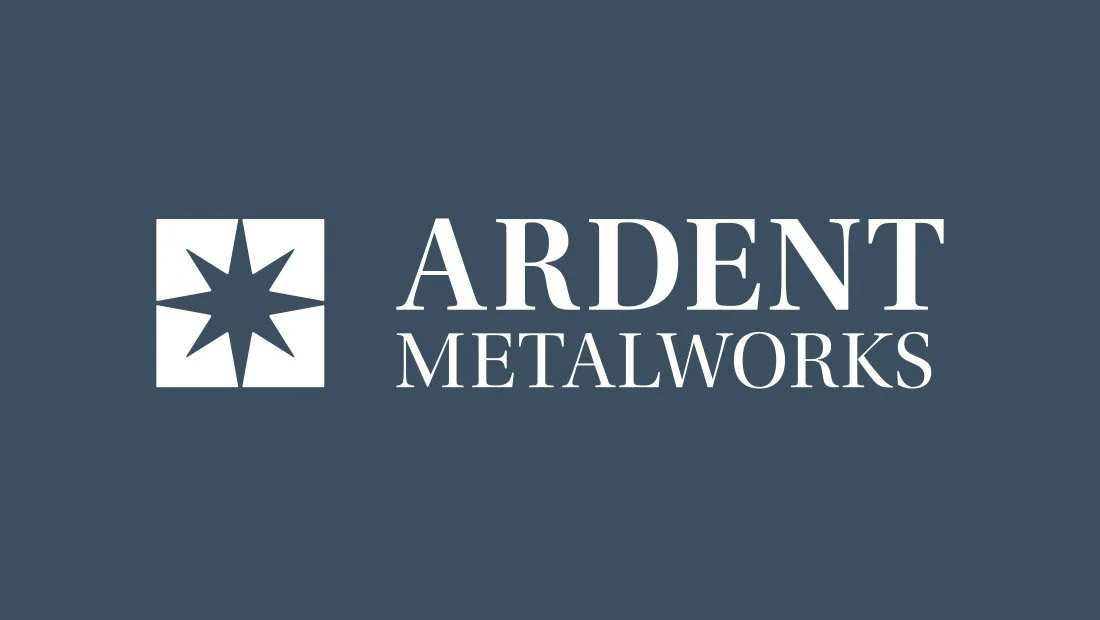
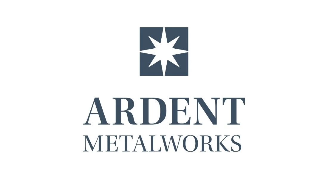
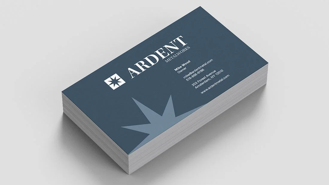
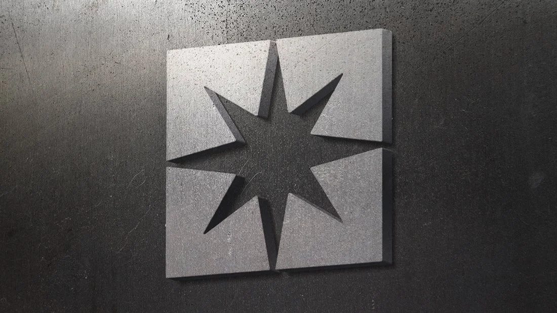
The final Ardent Metalworks logo design focuses on the word “ardent,” which means to burn. The logo design features an eight-pointed star, which represents the heat and sparks produced during the welding process.
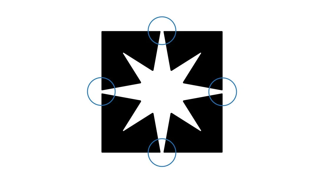
The logo design includes small vents where the top, left, right and bottom star points meet the bounding square. This means the star shape is not fully enclosed and can be easily reproduced on a CNC machine.
The spark star also resembles a cut diamond--a longstanding symbol of luxury, beauty and perfection. This logo design features an understated steely blue-grey color.
Navigate: Logo Design | CNC Logo Design | Social Media Logo Design | Company Branding
CNC Logo Design
Navigate: Logo Design | CNC Logo Design | Social Media Logo Design | Company Branding
Social Media Logo Design
Navigate: Logo Design | CNC Logo Design | Social Logo Design | Company Branding
Company Branding
Navigate: Logo Design | CNC Logo Design | Social Media Logo Design | Company Branding
Marketing Case Studies
Insomniac Studios logo design, branding and marketing case studies are an in-depth analysis of a project or concept. Some marketing case studies are the result of a client relationship. Others explore solutions to hypothetical projects. Not all marketing case studies represent a contract or partnership with the entity presented. The logo design, branding, marketing, graphic design, advertising, strategies, concepts and analysis presented are the copyrighted and intellectual property of Insomniac Studios and its clients.
Contact Insomniac Studios
If you like the thinking behind this branding and logo design project and would like to put it to work for your company or organization, contact Insomniac Studios.

