LeRoy Brands Logo
LeRoy Brand Foods started in 1962 as LeRoy Shipping, Inc., shortly after the 1960 opening of the Ogdensburg-Prescott International Bridge. The new bridge linked Ogdensburg, New York, to Johnstown, Ontario, and, further north, Ottawa. The bridge connected the small St. Lawrence River port city to the bustling hub of Canada’s capital city.
The company was started by Corbin “Corby” LeRoy, a long-time employee of the New York Central Railroad. The LeRoy family traced back to 18th century French fur traders and, before that, 15th century northern France. The name LeRoy (Leroy or Le Roy) translates from French to The King. The LeRoy family crest is a shield bearing three stars. The family motto translates to “The stars show kings the road.” A fitting motto for a transportation company.


Company History
To support his community, LeRoy hired local truck owners and operators rather than union teamsters. These owner-operators provided the flexibility the fledgling company needed. However, by the early 1970s, the looming gas crisis in America cast a shadow over the company. The lack of available fuel, rising gas prices and a new national 55 mph speed limit added new pressures. In December 1973, the crisis came to a head as drivers across the country stopped driving and blocked highways; shutting down America’s economy.
Only two LeRoy Shipping drivers participated in the protests, but it was enough. The fallout cost the company. LeRoy Shipping lost one major contract and faced penalties for the second. The stress proved too much for Corby LeRoy.
Following his death, Corby’s wife Loretta and two sons, Peter and Charles, took over the business. The following decade was difficult. The upstate New York location proved a hardship for the company. U.S. and Canadian commercial traffic relied on the highspeed lanes of Interstate 81 to the west, which more quickly connected to Interstate 90 and the United States’ interior, and Interstates 87 and 89 to the east, which connected Montreal to New York and Boston, respectively. Larger ports upstream on the St. Lawrence River secured more and more business. In 2004, the company began to source and distribute its own products under the name LeRoy Brand Foods.
LeRoy Brand Foods produces and distributes discount food products for grocery stores in the American northeast and Canadian southeast. Because the company owns its own shipping, it is able to keep costs down and offer a competitively priced product. LeRoy Brand Foods is know for quality and value.
Logo Design Brief
As a third-generation family business, family and community are an important of the company’s ethos. LeRoy Brand Foods leadership decided the new logo design should pay tribute to the company’s origin. Leadership requested the new logo design feel in some way connected to the spirit of the company’s first logo.
Logo Design Process
Insomniac Studios chose to focus on the shield emblem from the company’s first logo. However, it became apparent early in the logo design process that the classic shield shape created two distinct visual problems: The first of which was that each new logo design felt like a facsimile of the original logo design. Any attempt to include the shield logo mark alongside the company name only produced iterations of the company’s original logo rather than a new logo. The second problem was that the medieval shield design did not fit with the company. Attempts various design solutions succeeded in creating Renaissance Fair logos.
Insomniac Studios removed the curves from the shield shape and created an angular five-sided pentagon. This design choice moved the logo from the 15th century to the 21st. Moving the logotype inside the pentagon created an enclosure for the logo. The pentagon provided a background for the logotype. Placing the logotype inside the shield further separated the new logo design from the original. The crown above the logotype refers to the family’s name, which translates to The King from French. As a final kingly connection, the logo appears in a regal purple color.
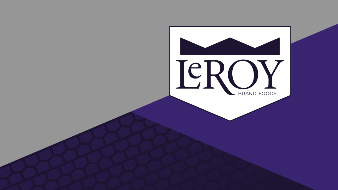
Turned upside down, the five-sided pentagon resembles a house to represent family and community. Insomniac Studios repeated the shape to create a tire tread pattern for backgrounds and graphic design applications. The tire treads represent the company’s history in the shipping industry.
Navigate: Logo Design | Brand Identity
Marketing Case Studies
Insomniac Studios logo design, branding and marketing case studies are an in-depth analysis of a project or concept. Some marketing case studies are the result of a client relationship. Others explore solutions to hypothetical projects. Not all marketing case studies represent a contract or partnership with the entity presented. The logo design, branding, marketing, graphic design, advertising, strategies, concepts and analysis presented are the copyrighted and intellectual property of Insomniac Studios and its clients.
Contact Insomniac Studios
If you like the thinking behind this branding, logo design and marketing project and would like to put it to work for your company or organization, contact Insomniac Studios.


