Fiber Council Logo and Marketing
The National Dietary Fiber Council (NDFC) is an association of health care professionals, farmers and agricultural lobbyists dedicated to raising awareness for the health benefits of a high-fiber diet. Founded in 1987, the council sponsors and reviews academic studies and advises heath care, agriculture and food production industries on the science behind fiber-based nutrition.

Logo Design Brief
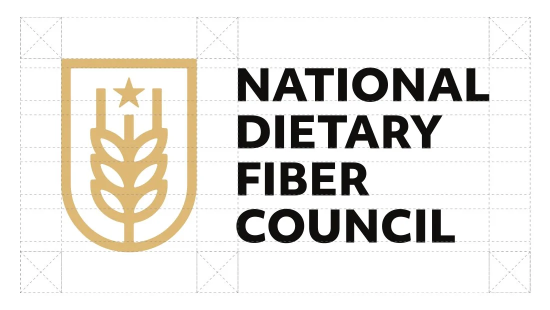
The NDFC sought to replace its longtime logo with a new, contemporary design. Originally developed to look like a university seal, the NDFC’s previous logo was literal and unnecessarily detailed. Insomniac Studios worked to streamline the design and create a strong, simple logo to update the organization’s brand identity.
Logo Design Process
The idea to use grain as a symbol came early in the logo design process. Finding a way to present the grain in a way that didn’t feel contrived became the challenge.
The rounded shield enclosure neatly solved two visual problems. Without the shield enclosure, the grain is forced to balance on the stalk protruding beneath the kernels. This caused the grain’s visual weight to balance precariously on a thin stalk, the way it naturally does. Despite this natural occurrence, the logo design looked wobbly and in danger of falling over. Adding the shield enclosure to the logo retuned the visual weight to the bottom of the logo design. Together with the star, the shield logo enclosure reinforces the organization’s national identity. Shields often appear on government seals and military insignias. Their iconography can lend a sense of history and formality to a logo design. Because the shield’s bottom is round, rather than pointed like a traditional shield, the idea of a shield or badge is implied in the logo design without it feeling overtly historical, militaristic or heraldic.
The logo design’s color was also important. Finding a wheat or grain color that wasn’t too yellow or too brown took some time. Sampling colors from photos of wheat and barley failed to yield a color suitable for the logo design. When the logo color was too saturated or bright, it didn’t match the direction the new brand identity was taking. Too dull or bland, and the logo design looked washed out. This caused legibility issues when the logo was presented on a white background. The final creamy wheat color fits the logo’s design and the brand identity’s natural look. When paired with the dark brown in design applications, the color can be used as an accent.
The three lines extending from the wheat’s head depict hair-like filaments called the wheat’s beard. In the logo’s design, the lines represent the council’s three core tenets of science, health and education. The addition of the five-point star is reminiscent of the stars and stripes on the American flag.
Company Branding
Insomniac Studios redesigned the council’s visual brand identity. The Rochester, New York, marketing and logo design agency created new print business cards and letterhead for the NDFC.
Printed on uncoated paper, the business cards and letterhead have a soft, natural feel, rather than a slick glossy one. This subtle detail makes the organization feel more organic and agrarian.
Marketing
Dietary fiber is categorized as either soluble or insoluble. Soluble fiber dissolves in water, while insoluble fiber largely passes through the human digestive system undigested. Soluble fiber can lower cholesterol and blood sugar levels. Insoluble fiber helps the body manage solid waste. While important, the latter can be an unpleasant or uncomfortable discussion. To raise awareness for its mission, the organization opted to use humor. The Move Mountains campaign seeks to inform the public, in particular middle-aged men and women, of the important role fiber plays in their health.
Navigate: Logo Design | Alternate Logos | Brand Identity | Brand Marketing
Marketing Case Studies
Insomniac Studios logo design, branding and marketing case studies are an in-depth analysis of a project or concept. Some marketing case studies are the result of a client relationship. Others explore solutions to hypothetical projects. Not all marketing case studies represent a contract or partnership with the entity presented. The logo design, branding, marketing, graphic design, advertising, strategies, concepts and analysis presented are the copyrighted and intellectual property of Insomniac Studios and its clients.
Contact Insomniac Studios
If you like the thinking behind this branding, logo design and marketing project and would like to put it to work for your company or organization, contact Insomniac Studios.


